The Value vs Effort Matrix: How to Find Your Quick Wins
September 6, 2026
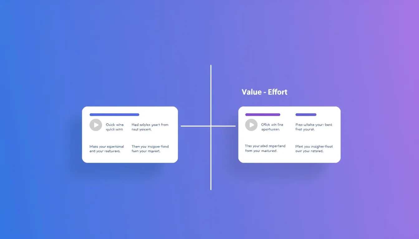
If you want a prioritization method you can run on a whiteboard in ten minutes, it's the value vs effort matrix. No formulas, no scoring spreadsheets — just plot each feature by how much value it delivers and how much effort it takes, and let the picture tell you where to start. It's the go-to for small teams and quick decisions.
The 2x2
Draw two axes: value (low to high, vertical) and effort (low to high, horizontal). That creates four quadrants, each with a clear meaning.
High value, low effort — Quick Wins (top-left). Do these first. Maximum payoff for minimum work. These are the features that make you look responsive and build momentum. Your feature request board often surfaces several — highly upvoted requests that turn out to be small builds.
High value, high effort — Big Bets (top-right). Worth doing, but plan them. These are your major projects: schedule them deliberately, don't let them crowd out quick wins, and make sure the value is real before committing.
Low value, low effort — Fill-ins (bottom-left). Do them if you have spare capacity, ignore them if you don't. Harmless but not important.
Low value, high effort — Time Sinks (bottom-right). Avoid. These are the features that quietly eat months for little return. The matrix's biggest gift is making these visible so you can say no.
How to plot features
For value, use whatever signals you have: vote counts from your board, revenue impact, retention effect, strategic fit. You don't need a precise number — relative positioning is enough. For effort, get a rough estimate from whoever will build it (engineers, not stakeholders). Then place each feature as a dot. The clustering does the rest.
The key mindset: you're comparing features against each other, not measuring them absolutely. "Higher and more to the left than that one" is all you need.
Why it works (and its limits)
The matrix is fast, visual, and impossible to misread — anyone can look at it and see the priorities. That makes it perfect for a small backlog and for aligning a team quickly.
Its limit is precision. With dozens of features, dots cluster and the picture gets muddy; that's when a scoring framework like RICE earns its keep. And "value" hides a lot of judgment — grounding it in real voting data keeps it honest rather than a reflection of whoever's loudest in the room.
Where it fits
Reach for the value vs effort matrix when you have a manageable list and need a decision now. For bigger backlogs, defensible rankings, or release scoping, see the other options in our six prioritization frameworks — and our guide on prioritizing feature requests for the full process.
Start with the value axis
The hardest part of the matrix is knowing what's actually valuable — which comes from users. Create a free feedback board on FeatureRequest, let votes reveal value, and plot your quick wins with confidence.
Let your users tell you what to build
A public board where customers post requests and vote on them. Free for your first board.
Start free